


Roadtrip!’s Game Board Kludge – When Flavor Dominates, Everyone Cries
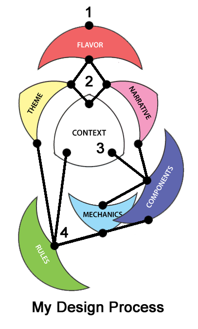 Well, I’m nothing if not obstinate. Perhaps it’s the Capricorn in me; maybe it’s because I’m the first child; possibly it’s just because I don’t like the word impossible. Whatever the reason, I recognized that it took me entirely too long to fix some of the problems in my game Roadtrip! In an effort to understand why, I undertook an analysis of my own game design process, and then used that newfound knowledge to scrutinize what when wrong. I continue to encourage all game designers to revisit their own design process. Feel free to post here with your own insights! I have used Major’s Game Design Elements for ease of discussion. The past few posts detail the beginning of that journey for me. Though this post concludes this public discourse, it in no way finalizes the analysis. Remember, I’m obstinate.
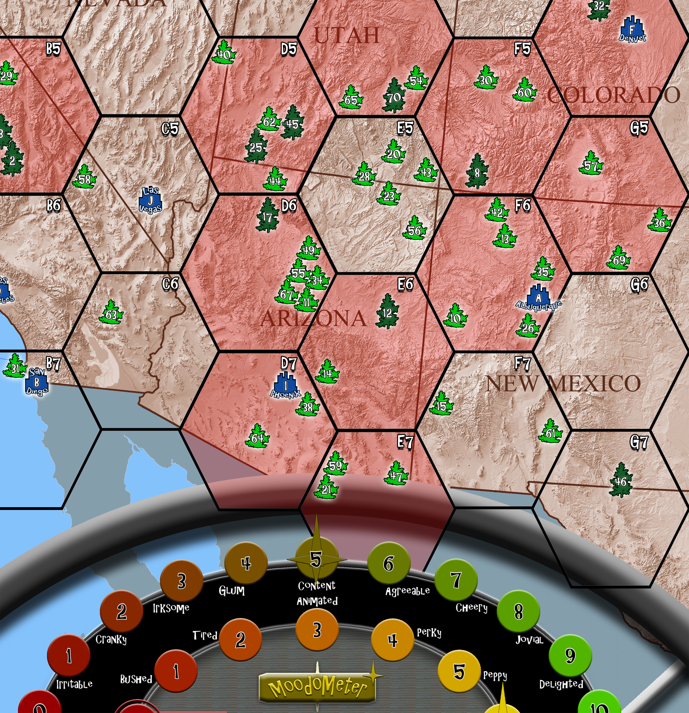
When I first imagined Roadtrip!, I envisioned players moving little car tokens across a map of the Western United States along the famous U.S. Routes between national sites, touristy towns, and whacky kitsch stops. I was recreating the exact experience. A player drives from The Grand Canyon to the Petrified Forest taking U.S. Route 89 (National Park Highway), to U.S. Route 66 through Flagstaff and Winona, stopping at a gas station, staying at the Wigwam Motel in Holbrook, and getting a speeding ticket in the Petrified Forest. It was really cool; the flavor was astonishing; it was bound to fail.

Trademarks and copyrights (for all those cool, actual, road side attractions) aside, the complexity of the game board was overwhelming. The board alone had to be huge (30″x36″) to accommodate all that detail. It was unsustainable. My focus on flavor meant (again) that narrative dominated the component, and so mechanics suffered. To fix it, I proposed a series of changes to my early playtesters – everything from eliminating kitsch stops, to taking out road hazards, to removing the roads altogether. The playtesters balked. They had bought into my vision 100%, even if the experience of the actual game play was frustrating to them. I wanted to agree! And here is where the League of Gamemakers’ article, The Stages of Playtesting, would have come in handy. While I admit, that I exhibited behavior from stages 1-3, stage 4 (Everyone’s Right), is my true playtest weakness. Had I recognized that, it would have saved me much earlier. However, I actually ended up adding another mechanic to the board (called regions), before I decided to take an entirely different tactic.
I stopped tweaking and fiddling, trying to reorganize to somehow make everything work. Instead, I prioritized the mechanics on the board by their importance to the overall game concept.
Prioritized mechanics on the board
National Parks and Monuments
Map of the Western U.S.
Moodometer (measure of players’ Happiness and Energy)
Road Hazards
Kitsch
Gas Stations
U.S. Routes
Regions
Then I asked, if the mechanic was absolutely necessary to Roadtrip!. If the answer was yes, then I asked if it had to be represented on the board. Here’s where I ended up:
Mechanics that had to be on the game board
Map of the Western U.S.
National Parks and Monuments
Moodometer
Gas Stations of some sort
Mechanics that needed to be in the game for flavor
Road Hazards – What road trip is complete without some memorable misstep?
Kitsch – What road trip is complete without a stop at World’s Biggest X (you insert noun)?
Mechanics that could be jettisoned
U.S. Routes – cool, but clunky in actual game play
Regions – really, no value added here
The end result was quite surprising. With the addition of hex movement, instead of linear ‘roads’, the board shrank to a manageable 18″x24″! National Parks and Monuments were represented with much smaller icons since I moved all the information previously conveyed on the board onto their individual cards. Gas stations, which were still necessary as a resource drain, became abstracted into shaded hexes. Furthermore, all the fun of road hazards and kitsch got compiled into a single deck, called Highway cards, which players strategically play throughout the game. I did not entirely rip out everything, as my favorite saying in game design goes (when in doubt, rip it out). I did, however, drastically simplify, by removing mechanics spawned solely from a flavor-dominant process. Prioritizing helped immensely with the mechanics-overloaded, narrative-rich game board. Moreover, prioritizing enabled me to clarify with my playtesters why I made certain decisions. There was no further crying over the bygone U.S. Routes.
Over the past few weeks I’ve undertaken a challenge to analyze my own design process. I encourage(d) you designers out there to do the same. While I have used Major’s Game Design Elements as a basis for this discussion, I’m sure there are other valid models out there. The importance of this exercise lies in thinking about your approach. Even the smallest reflection can add value to later designs. In my case, I learned that it’s all about flavor. There’s nothing wrong with that. Rather, it’s the understanding that empowers reflection, which can then provide valuable insight for future designs. Next time, it will be easier. Not easier to create, so to speak, easier to streamline the process (there’s my program manager!). After all, who enjoys going round in circles chasing our tails? Well, besides some cats and dogs…
1 Comment on “Classic Cars & National Parks: Lessons Learned from a Game Design – Part III”