Roadtrip!’s Theme Mechanic – When Flavor Drives Rules To Ruin
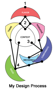
To continue the discussion from the last two posts, if you want to design more robust games and design them faster, I believe it’s crucial to analyze your game design process. I admit that the impetus to undertake this discussion arises from my program management background. To some extent, one might argue that designing, developing, and producing complex military systems  has nothing to do with game design. But that would be wrong. Program management fundamentals apply equally to any project one tries to develop. The player mats from last post did not provide adequate information visibility (context) nor were they producible (component) – both issues a holistic view of any project can address early on. But when you are stuck in the trees, sometimes you don’t see the forest. In my case, using Major’s Game Design Elements, I was always emphasizing Flavor above all else. Consequently, a number of frustrating issues occurred in my development of Roadtrip! that could have been prevented much earlier if I had better managed my own process. Three of those problems – the player mats, the theme mechanic, and the game board – are worth discussing in depth to illustrate the various ways such a reliance on a singular approach can hamper design. This post is about the game’s theme mechanic (not to be confused with Major’s Theme game element).
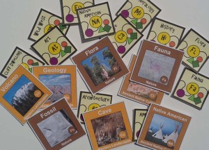
For Roadtrip! when I first began researching the National Parks in depth, I knew that I wanted to embed as much park information as possible. Providing educational opportunities in games is one of the tenets of my design philosophy. Beyond that, however, including some basic trivia helps the game come alive for players. When I gathered the list of sites and organized the data, I realized that you could group these destinations in a variety of different categories based on things they had in common. For instance, many parks have cliff dwellings; Mesa Verde immediately comes to mind. But did you know that Bandelier, Tonto, and Walnut Canyon, among others, also have some? Clearly, Dinosaur has fossils, but so do White Sands and Zion. In categorizing the parks, I was attempting to highlight some of the smaller monuments and some of the lesser known aspects of the well-known parks. Furthermore, this categorization exemplifies how some people approach planning a holiday. While geographic proximity frequently factors, so do peoples’ interests, like architecture, Native American history, or volcanos. Thus, from these simple-sounding categories, the theme mechanic was born.
The initial rule, driven from Flavor downward to Mechanic, was to assign one theme to each National Monument and two to each National Park. Then during game setup, after they knew which destinations they were required to visit, players would each get to choose two themes. When a player visited a destination that had his theme, he would receive a boost in his Energy resource. In other words, it represented an enthusiasm for an aspect of a park that helped overcome the natural fatigue of whirlwind vacations.
It sounded simple enough. Right? Well, not so much… Playtesting revealed two interrelated problems. First, astute players (read: very experienced gamers) were never low on Energy, a resource meant to be budgeted wisely; and so, they never were presented with tactically interesting choices. Second, average players (read: occasional gamers) got confused by the mechanic. They either then ignored theme entirely or used it only sporadically. Something needed to be changed obviously.

I went through a host of iterations to solve the problem with the theme mechanic. I added more themes both in number and to each individual site, reasoning that by adding more I’d challenge the astute player with additional complexity and help out the average player with more chances for successful recognition. When that didn’t work, I tried rebalancing each destination’s categories, as if somehow emphasizing fossils over geology was the solution. But that fix, in addition to not solving the problem, began to compromise educational integrity. Finally, I added meta-themes on top of the original themes. I believed that somehow broader categorization would alleviate confusion for the average player, while giving the astute player more choices to consider. Nothing worked. I even began to reevaluate my audience. Did I really need to design a game that would appeal to a variety of experience levels? But if the core principles of Roadtrip! were to create a game that appealed to classic car enthusiasts and National Parks devotees, so to speak, then I couldn’t just jettison part of the audience. What was I to do?
Then I remembered some advice I had heard at a seminar on game design: when in doubt, rip it out. Well, it went something like that. I wish I could give credit to speaker, but my notes are a bit scant. So, I simplified. I just removed theme entirely. It was something I should have done a lot earlier, but I was too focused on keeping that rule, which had been generated by flavor. With theme gone, the game became much harder for astute players since they couldn’t ignore the Energy resource, and much easier for the average players since they had one less rule to monitor. As for embedding educational information in Roadtrip!, the fun facts are still there; they just don’t need to be used to add unnecessary rules.
Next, I’ll explore the game board kludge. You would have thought I’d have learned… When Flavor Dominates, Everyone Cries.

1 Comment on “Classic Cars & National Parks: Lessons Learned from a Game Design – Part II”