Another week gone – new cards, two more playtests, a new game board design, and my Tips & Tricks from a Female GM article done!
The New Game Board Graphics
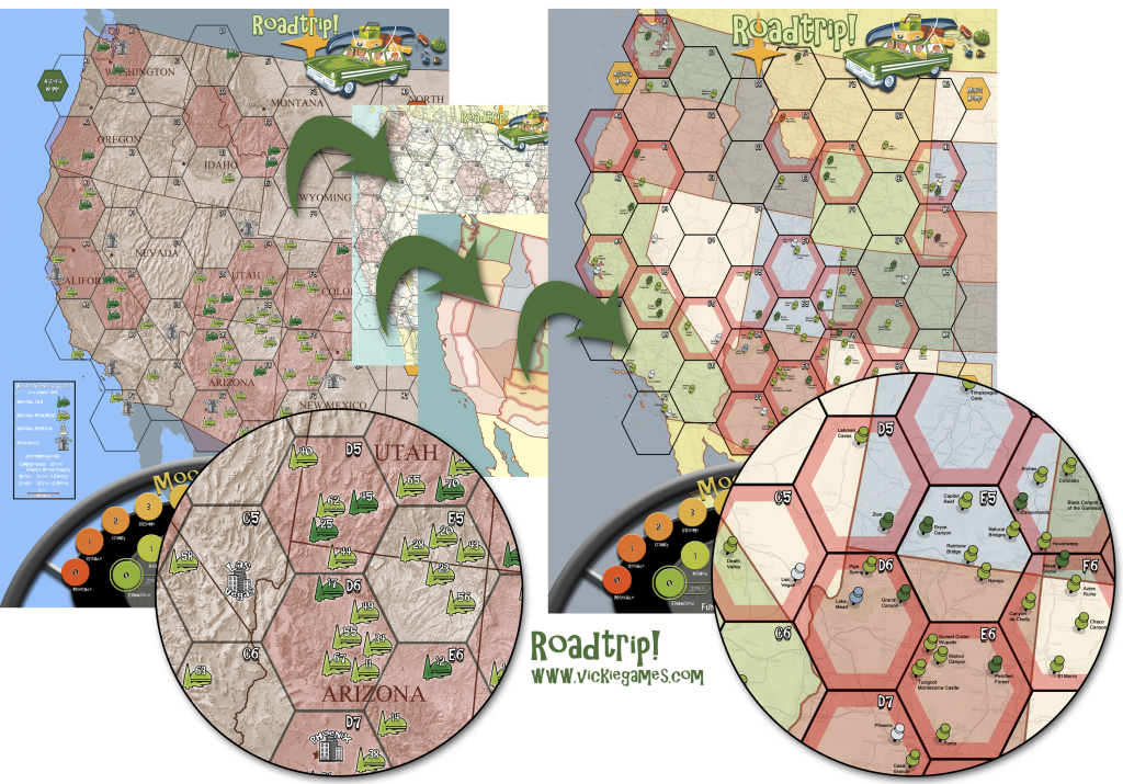
After taking into consideration the thoughtful suggestions from my playtesters, here is a sneak peak at the new game board graphic. I’m still adjusting and tweaking. The states need labels. It needs a legend. There will be a revamped Moodometer soon. Nevertheless, the basic idea, I believe, is solid. Let me know what you think!

- States Colored. This addresses the concerns that the states could not easily be discerned behind the hexes. It has the added bonus of now looking much closer to standard maps, which, at the very least, use a colorized inner boarder. I may attempt to added the standard map boarder line of a long dash and two short dashes.
- Topographic Map Removed. As has been pointed out to me, folks on road trips rarely rely on topographic maps to chart their vacations. The USGS map, to which I added a sepia tone, was mostly a place holder until I could budget an artist for a stylized graphic. Yet, in the meantime, it was distracting to some players and counter-themed to others. As you can see from the image above, I did try out an actual 1965 map. However, it was far too busy to be a serious contender by itself. Instead, I faded the map out quite a bit underneath the colorized states. At least until I get the stylized version I’m hoping to have, I think this is a good compromise.
- Hexes Remain. I was challenged by a couple of playtesters to see if I could remove the hexes altogether. It made some sense from my mantra of ‘Keep it Simple.’ Thus, I pulled out the hexes altogether and toyed with movement based on states alone. Some states were just too big though. So, I broke up the states into sections consistent with highway travel. You can see a colorized version above. Honestly, I thought this was a radically cool idea. Needless to say, I previewed it to a few casual gamers and they found it horribly confusing. In fact, they wanted to know why I even removed hexes in the first place. Hexes, they said, were a simple mechanic for movement.
-

Kermit the Frog? Really? Push-Pins In. Just like I’ve seen in people’s houses – maps mounted on cork board with pins denoting places to which they’ve traveled – I opted for this universal symbol to designate all Destinations. It especially works well with the background faded map. Originally, I wanted to use the National Park Service arrowhead for the National Parks and Monuments, but it’s trademarked. And I did not want to risk relying upon something to which I might never have access. Taking out pen and paper, I drew what I thought was a graphic of a tree next to a hill and a lake. Apparently, without knowing it, I excel at surrealism. It was variously interpreted as different muppets, an alligator, a hamburger, Pinocchio, or an old woman’s face. So, I swallowed my pride and went with this more simple icon to represent all of the Destinations. They remain color-coded for Destination type (National Park, National Monument, National Memorial, National Battlefield, and Metropolis).
New Highway & Passenger Cards!

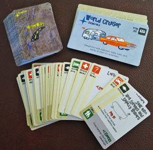
The new cards are back from The Game Crafter! The Highway cards were scrubbed and balanced. There are no longer any multi-condition cards. Their layout was rearranged for usability. The Passenger cards got some tweaking too, mostly to remove a few of the rather burdensome traits. In the one playtest I’ve run since getting the cards, there were no comments directed at them. So, at least for the moment, they appear relatively stable. Of course, both could use an artists touch… for sure, they need professional illustrations. That will have to wait until a Kickstarter, a generous artist, or a winning lottery ticket.
Shout-Outs!
- Dubious Alliance – Wonder what creator Brandon Raasch had to promise the Lich King in order to entice a visit in Santa Cruz?
- Double Exposure – It just hit me this week that I’m headed to Metatopia in a few weeks! Hope to see you all there!
- The Cardboard Knight – Their starting a new series of articles called Knight’s Watch, and guess what?! I’ll be in one of their first features! So, a big thanks goes out to them for including me in their new endeavor! Their first article should be out tomorrow!
- Foxtrot Games – I’m super excited about World’s Fair Kickstarter. What I love most is that it’s rich with an educational, strategy, non-fantasy, non-scifi theme. Don’t get me wrong, I’ve talked about this before, I do love those genres. I just think that it’s about time to break the mold and reach out to a wider audience with thoughtful games.
- Jeff Dehut at Explosive Limes – Ok, just as I said I love the non-fantasy genre boom, I’ll have to say I did back the new Pocket Dungeon expansion. Alright already, I also have a thing for the random tables in D&D books. This game just tickled that fancy.
Coming soon on VickieGames…
- A Visual Compilation of Game Creation – Roadtrip!’s journey from first sketch to current version.
- A Point Does Not a Trend Make – lessons learned from my first time seriously playtesting
- For the love of D&D randomness, I decided to start Project Random Dungeon…. got a temporary page up, still working on collating the book set and some basic rules.
- More information on a Print-on-Demand Version of Roadtrip!
