Last week, I asked the Chicken and Egg question of game designers: What comes first? Mechanic? Theme? Component? Audience? In other words, I asked how do we each design. Clearly, there is no single correct answer to this inquiry. Every individual is, in fact, individual; and so everyone has his or her own style. Nevertheless, I asked for two reasons. First, most people to whom I speak outside of the developer community want to know how one dreams up a game from scratch. I take such a question as somewhat of an interesting challenge because it’s actually hard to describe in any coherent fashion. Moreover, could I do it in a way that is more rigorous than just tucking away a  mental note? Second, I wanted to see if I could learn anything from understanding my own process once I was able to describe it. Improve and evolve, so to speak.
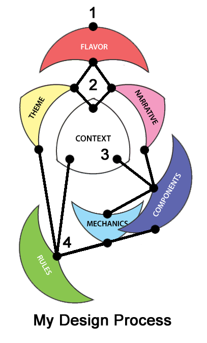
To delve into this challenge, and provide a framework which would foster discussion, I used Mark Major’s Game Design Elements from The League of Gamemakers. Then I ordered his model according to my own process. Sure enough, it did actually clarify the reasons for my design problems – my (sometimes relentless) focus on Flavor. Over the course of this week, In order to explain just how this process did really help me, I’m going to provide three detailed examples taken from my current game Roadtrip!
Where It All Starts (for me) – Flavor
As I said last week, and my hierarchy of Major’s model above shows, I inevitably start with Flavor, the emotional and imaginative experience I am trying to impart on players. For Roadtrip!, it was my brother’s birthday and I could not figure out what to get him. Always being the one for homemade gifts, I ran through a repertoire of crafts, but nothing stood out. So, I switched my tactic a bit, and asked what is it that he loves. Classic cars! (Flavor) A retro setting of the ‘50s and ‘60s! (Flavor) Oh, what if I made him a game with those elements? Of course, a game requires a bit more than the vintage cars, people and an era. That’s when, as fate would have it, I was watching my favorite documentary, Ken Burns’ The National Parks: America’s Best Idea. National Parks and National Monuments! Summer Vacations! (More Flavor). I would make a game not just about the quirky, hilarious, frustrating things that happen when you take your family on vacation, but also about these national treasures. (Narrative and Theme) It would be fun and subtly educational. Perfect!
Not so much… The problem quickly became that I was so wedded to flavor, I began to experience a host of issues simply because I could not see past it. This approach of mine does not impact solely board game design either. As an avid D&D player and gamemaster, I create PCs, NPCs, and environments that tend to have uniquely fun narratives and ambiance, but do not always work out so well in actual play. A little more focus on the rules, and therefore, the mechanics of RPG, helps my games thrive much more (even if you have to drag me to that spot kicking and screaming!). For the board game Roadtrip!, however, three game elements stand out as particularly good examples of the trouble created when I was overly reliant on one approach to the design process: the player mats, the theme mechanic, and the game board. As I explain these elements, their problems and how I worked through them, I challenge you to see if you can find examples of where you went astray because of too much focus on any single approach.
The Player Mats – When Narrative Overrules Mechanics
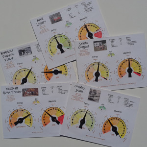
Since the kernel of the game idea emerged around vintage cars, I knew from the start that I wanted a dashboard-like mechanic. There would be dials! There would be photos from real cars! Vintage Trailers! My mind was abuzz with possibilities. Therefore, I began with a set of incredibly complex, yet quite thematic, dials, representing two important resources – Happiness and Energy – for each of five different vehicle-trailer combinations.

Truly, they were marvels of ingenuity, designed so as to conform to whatever configuration of family members you had in your vehicle. Car ad Trademarks and copyrights aside, two problems immediately arose. First, they were so complex as to be prohibitively costly to produce. I am not such a well-known designer that I can command massive resources to back such an extravagant venture. Second, and more importantly, early playtesters wanted to see the information on each other’s dashboards to facilitate better game awareness. Blind reliance on flavor and narrative in just this single component had led me to neglect the importance of sound mechanics and nearly ignore context all together.

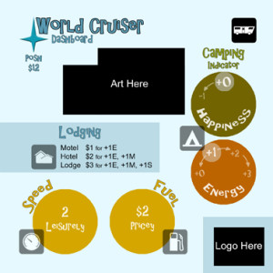
So, what did I do? I yanked the dials off of the player mats, eliminated actual dials, and made a single, two-axis track on the game board, called the Moodometer. Now, the player mats contained only narrative flavor about general vehicle-trailer combinations and the mechanical costs of performing routine actions. None of this brief explanation is to say that this change was easy. I love(d) those original mats! Furthermore, the player mats have continued to undergo numerous iterations as I have striven for a more succinct mechanic… so has the Moodometer. But the result of stepping back and changing my design perspective was a simpler and better game.
Next, I’ll explore the game’s theme rule and what can happen when theme goes awry… When Flavor Drives Rules To Ruin!

1 Comment on “Classic Cars & National Parks: Lessons Learned from a Game Design – Part 1”